Hello, Ahjeong Choi here!
I’m currently working as a Business Analyst at DESILO, and I’m here to introduce a visualization tool I use every day for data analytics tasks: DESILO Market Intelligence (beta version), a one-stop dashboard tool for data analytics and visualizations, specialized to handle homomorphically encrypted data!
Let's explore the various features of DESILO Market Intelligence by analyzing a sampled consumer transaction dataset.
🔎 Introducing DESILO MI
The Key Features of DESILO MI
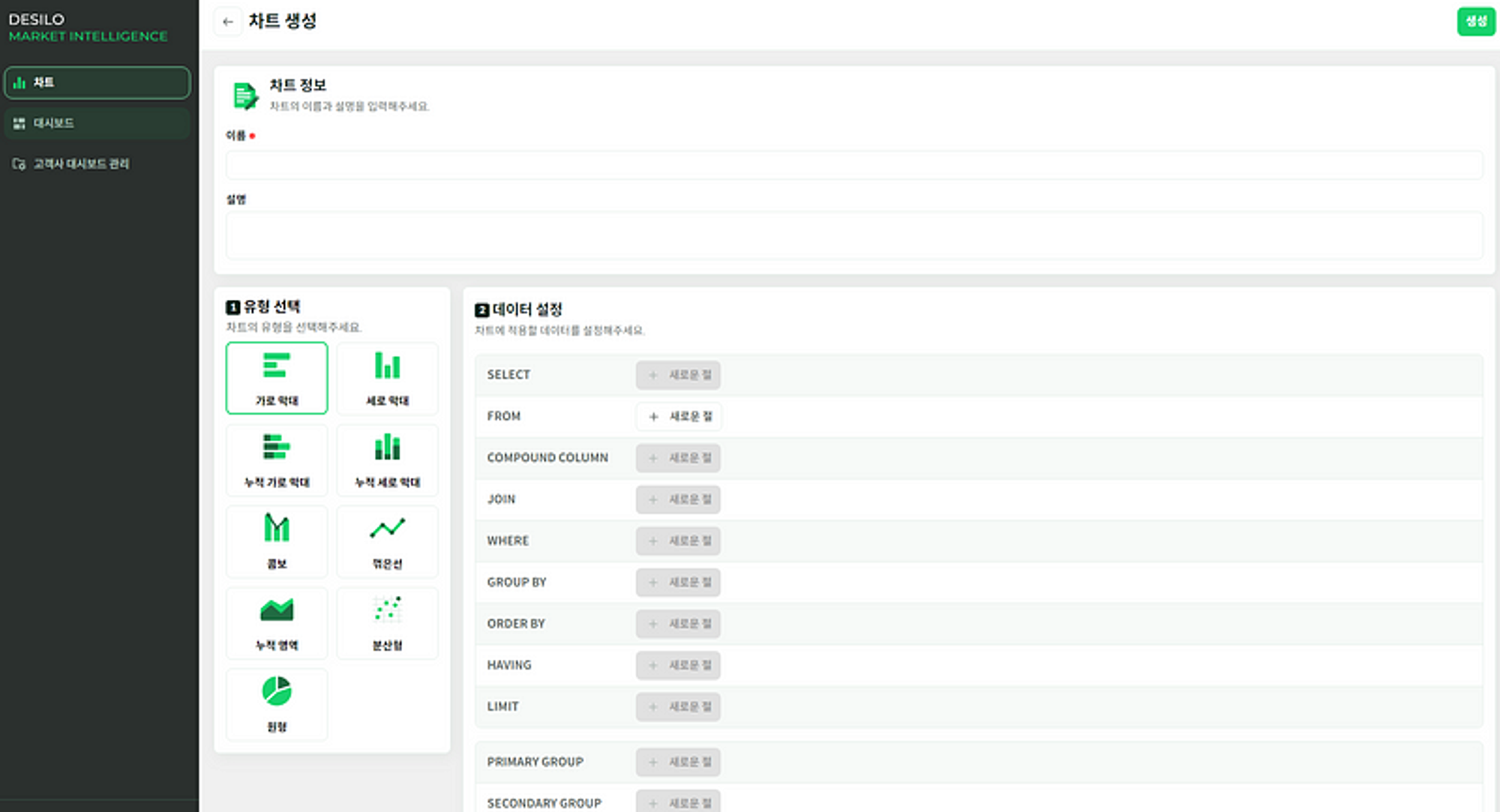
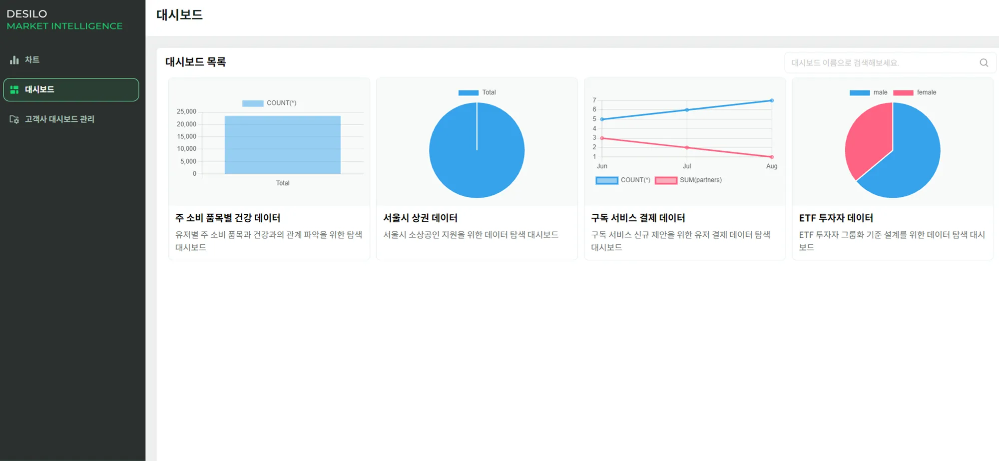
DESILO MI stands for DESILO Market Intelligence, and its naming comes from its purpose to serve as a visualization tool when analyzing market data. The current beta version offers various visualization and interactive dashboard features with which its users may derive market insights.
*The English version of DESILO MI will be available soon.
1️⃣ Rich Visualizations
Like DESILO DCR, DESILO MI enables visualizations of sensitive data using visual queries. It offers various charts, such as bar, line, scatter, and pie charts, to help understand data.
2️⃣ Dashboard
If visualizations created using MI are scattered around, it would indeed be challenging to utilize them effectively, right? Don't worry! 😁 DESILO MI also provides a dashboard feature that gathers visualization results. With customer dashboard management, you can select the necessary charts for presententation, allowing you to compare and view visualization materials needed in various industries all in one place.
Seeing is believing👀 Let's try using DESILO MI in real-world usage.

🔎 Let’s explore ETF investor data using DESILO MI
Let's analyze the investment assets from the sampled dataset using DESILO MI.
What are the characteristics of ETF investors?
We've identified gender and age distributions, along with investment capital and evaluation amounts, as key characteristics of ETF investors, and proceeded with our research.
With DESILO MI's dashboard feature, you can easily grasp these visualization charts on one page at a glance 👍
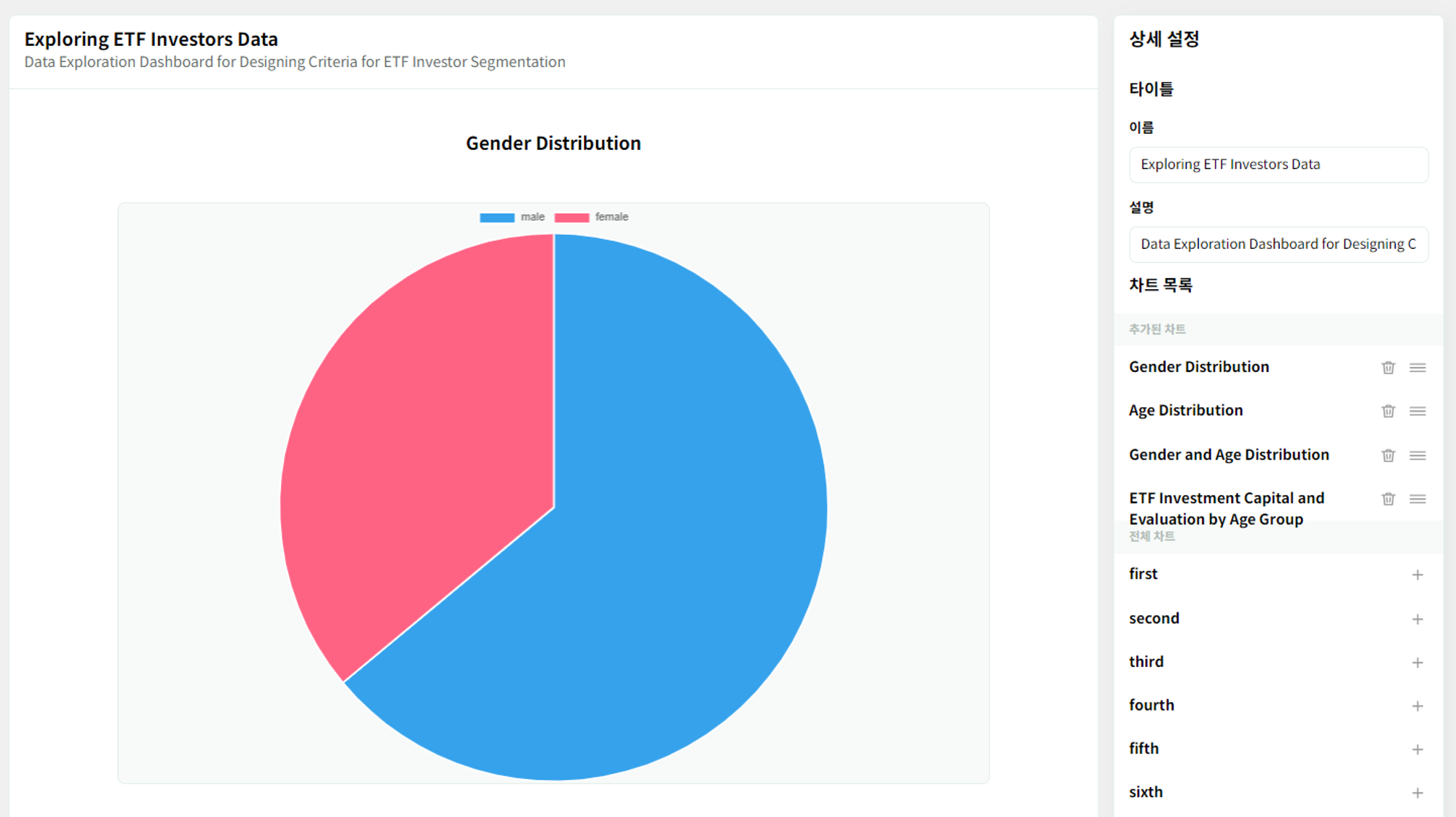
The dashboard feature in MI enables you to add or remove charts at any time, offering detailed customization options on the right side. Additionally, you have the flexibility to rearrange them according to your preferences. Let's examine the characteristics of ETF investors by looking at each chart in the above dashboard 🔍
*The dashboard and charts above are visualizations created by DESILO's SQL experts using DESILO MI product.
Gender Distribution of ETF Investors
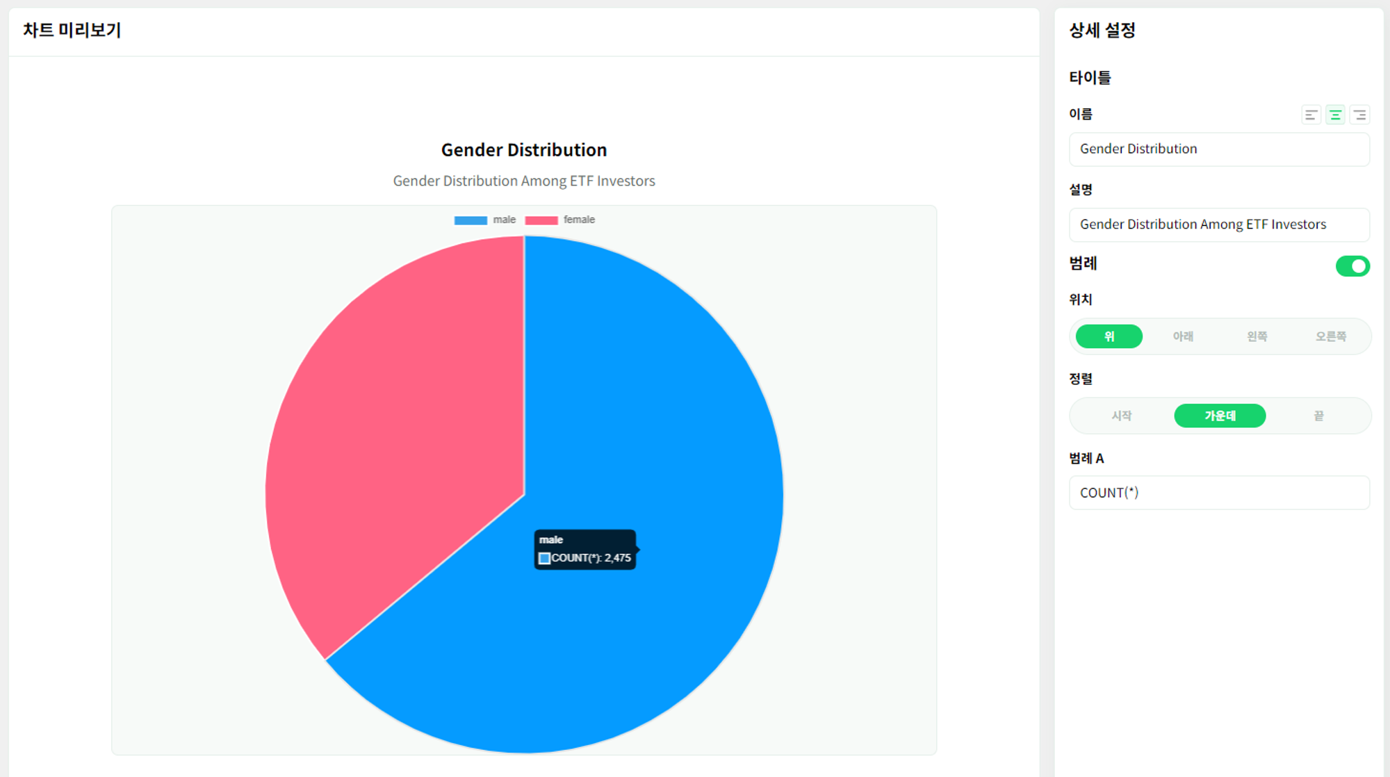
Using DESILO MI's pie chart, you can graphically illustrate the gender distribution of ETF investors (data collection period: July 2022-December 2022). After creating the chart, you can conveniently modify the chart name, description, and legends in real-time, using the detailed settings on the right 🤗
The pie chart above shows that approximately 55% of ETF investment transactions are made by men, while around 45% are made by women. This allows us to quickly grasp that men are more actively investing in ETFs.
Age Distribution of ETF Investors
What about the age distribution?
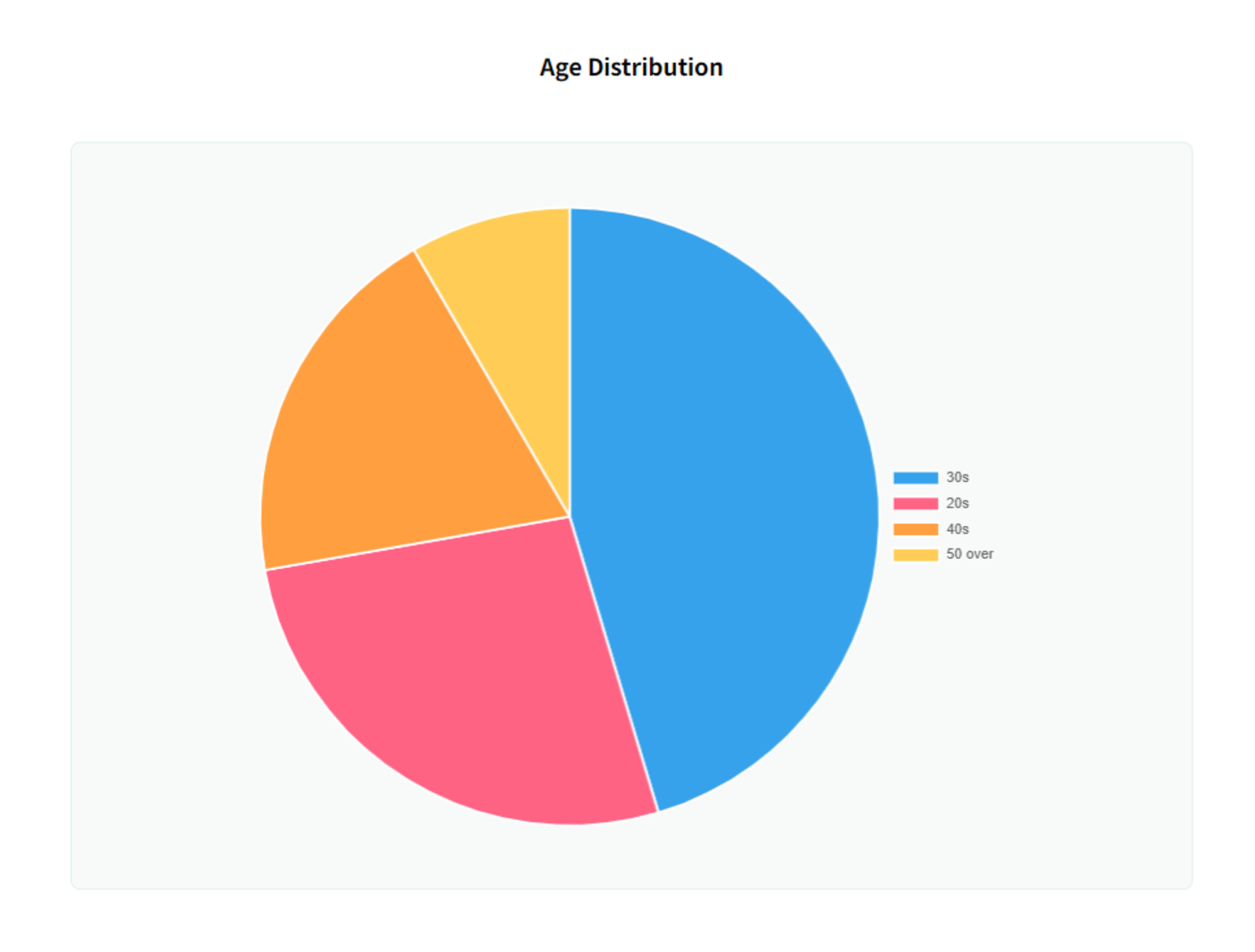
Similarly, using a pie chart, you can intuitively grasp the number of ETF investments by age group. It's clear that the age order is: 30s > 20s > 40s > 50s and above 😯 Especially, you can observe that the 30s account for about 45%, and the 20s for about 25%, making up around 70% of the total investments.
According to the sampled dataset, it can be concluded that men are the most active in ETF investments by gender, and people in their 30s are the most active by age group.
*Note: The composition of a consumer transaction sampled dataset may be skewed towards the 2030 age group and may not fully represent the demographics of the entire population.
Gender and Age Distribution of ETF Investors
If you look at gender and age together, what results will be shown?
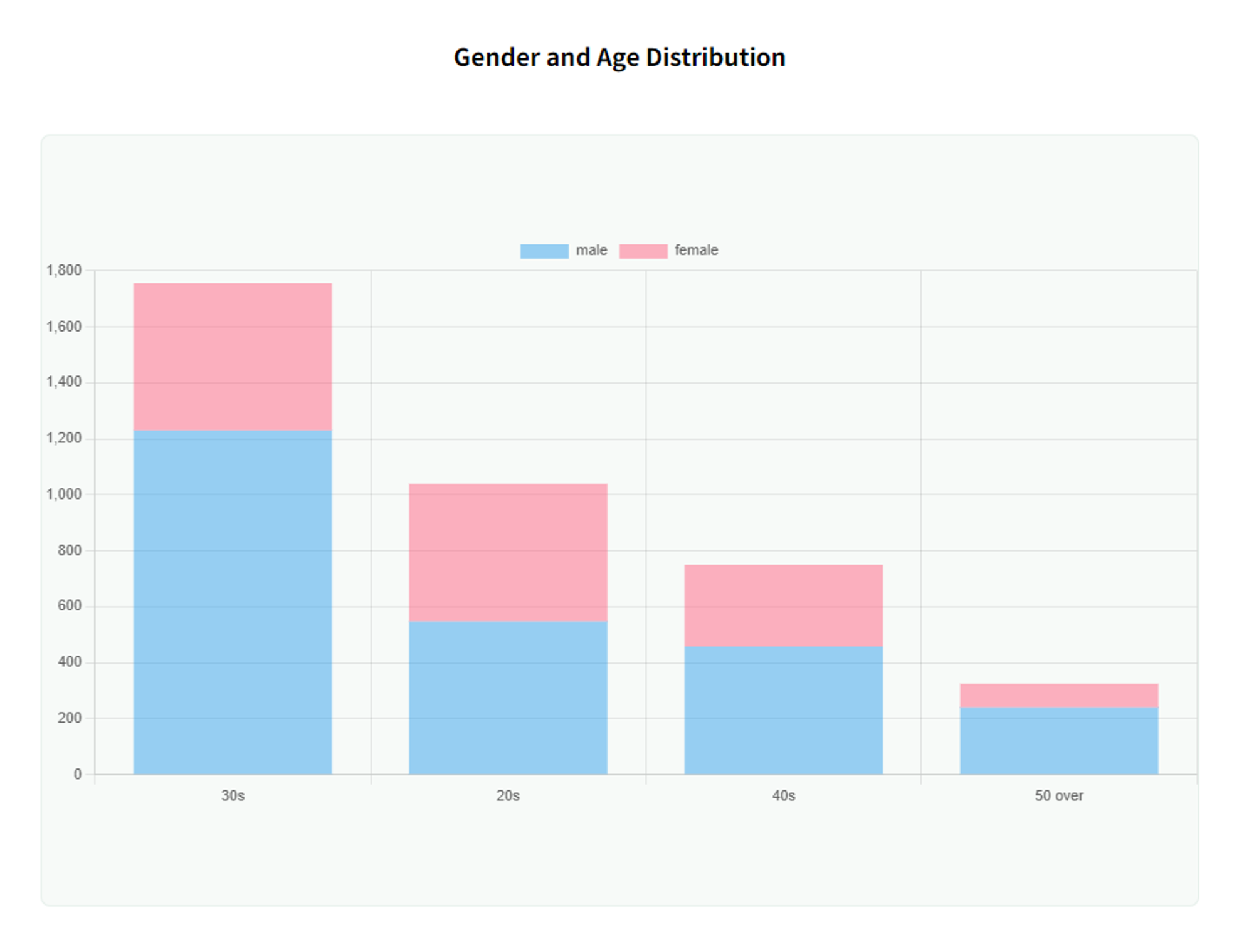
With DESILO MI's stacked vertical bar chart, you can easily visualize and grasp the trend at a glance!
It's apparent that men in their 30s exhibit the highest level of activity in ETF investments. Notably, in the 20s age group, both men and women are investing in comparable proportions🫢 There's a noteworthy observation as men progress from their 20s to their 30s, where there's roughly a doubling in the number of individuals engaging in ETF investments.
Insight: In their 20s, both men and women invest in ETFs in similar proportions, but men in their 30s invest approximately twice as much as men in their 20s.
Comparing ETF Investment Capital and Evaluation by Age Group
Ultimately, we invest to generate profit. Let’s take a look at how different age groups profited in terms of investment capital versus evaluations.
Let's visualize this using DESILO MI's combo chart, which provides visual diversity by using both bar and line charts simultaneously.
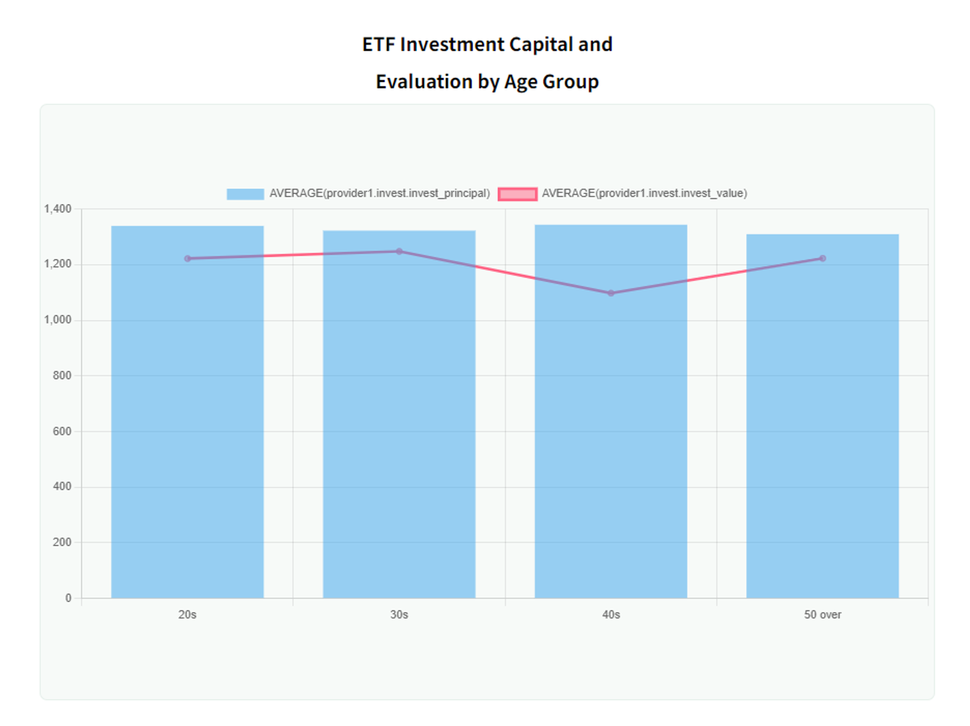
Regardless of age group, it is evident that the ETF investment averages in the range of 1.3 million won.
However, the average investment value decreases in the order of 30s > 50s/20s > 40s, indicating overall losses across all age groups, with the 40s experiencing the largest losses.
The average ETF investment capital is in the range of 1.3 million won, and the average evaluation amount of investments for people in their 40s is the lowest.

🔎 Learn more?
Up to this point, you’ve covered the rich visualization and dashboard features of DESILO MI, as well as explored methods for extracting insights through actual analysis.
Want to learn more about the ways to expand your research opportunities and marketing strategies using DESILO MI? If so, please subscribe to the newsletter below!
See you in your inbox 😊🖐️